Adding People to Renders: Entourage Done Right
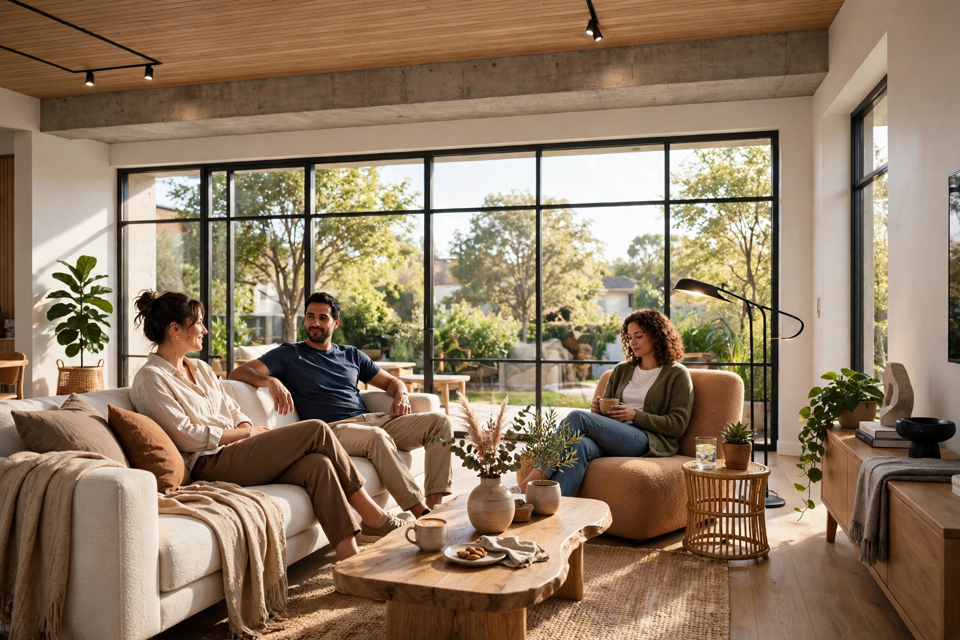
People are the fastest way to make an architectural render feel real, and the fastest way to ruin one. A well placed figure gives a space scale, warmth, and a story: a child running across a courtyard, a couple reading on a balcony, a barista at a cafe counter. A badly placed figure does the opposite. It floats above the floor, casts no shadow, wears a summer dress in a winter scene, or stares at the camera like a cardboard cutout. Clients notice instantly, even when they cannot explain why. This guide covers how professional visualization studios add people to renders, known as entourage, so figures support the architecture instead of distracting from it.
Why Entourage Matters More Than Most People Think
Architecture without people is hard to read. A sofa, a doorway, or a ceiling height means little until a human body stands next to it. A figure instantly tells the viewer how tall a room is, how deep a terrace runs, and whether a staircase feels generous or cramped. Developers use this deliberately. A marketing render of an empty penthouse looks like a showroom; the same render with a family cooking in the kitchen looks like a home someone wants to buy. That emotional shift is why entourage is standard in almost every commercial render, from apartment brochures to hotel investor decks.
The First Rule: Scale Is Everything
Nothing exposes a bad render faster than a wrongly scaled person. A figure that is even 10 percent too tall makes a room feel small; one that is too short makes furniture look oversized. Professional studios solve this with reference geometry. Before placing any figure, they check the model against real dimensions: a standard door is about 2.1 metres high, a dining table is about 75 centimetres high, and a seated person measures roughly 1.2 to 1.3 metres from floor to the top of the head. Every figure is then scaled to match the camera perspective, not just the image size. A person standing closer to the camera appears larger than one further away, and that perspective change must follow the render camera exactly.
Where to Place People, and Where Not To
Placement follows the same logic as camera angles for architectural renders: the figure should support the composition, never block it. The strongest positions are the foreground edges and the middle ground. A foreground figure, slightly out of focus or partially cropped by the frame edge, adds depth and pulls the viewer into the scene. A middle ground figure gives scale to the main space. Background figures should be small, soft, and few, just enough to suggest life without competing with the architecture.
Choosing the Right People for the Project
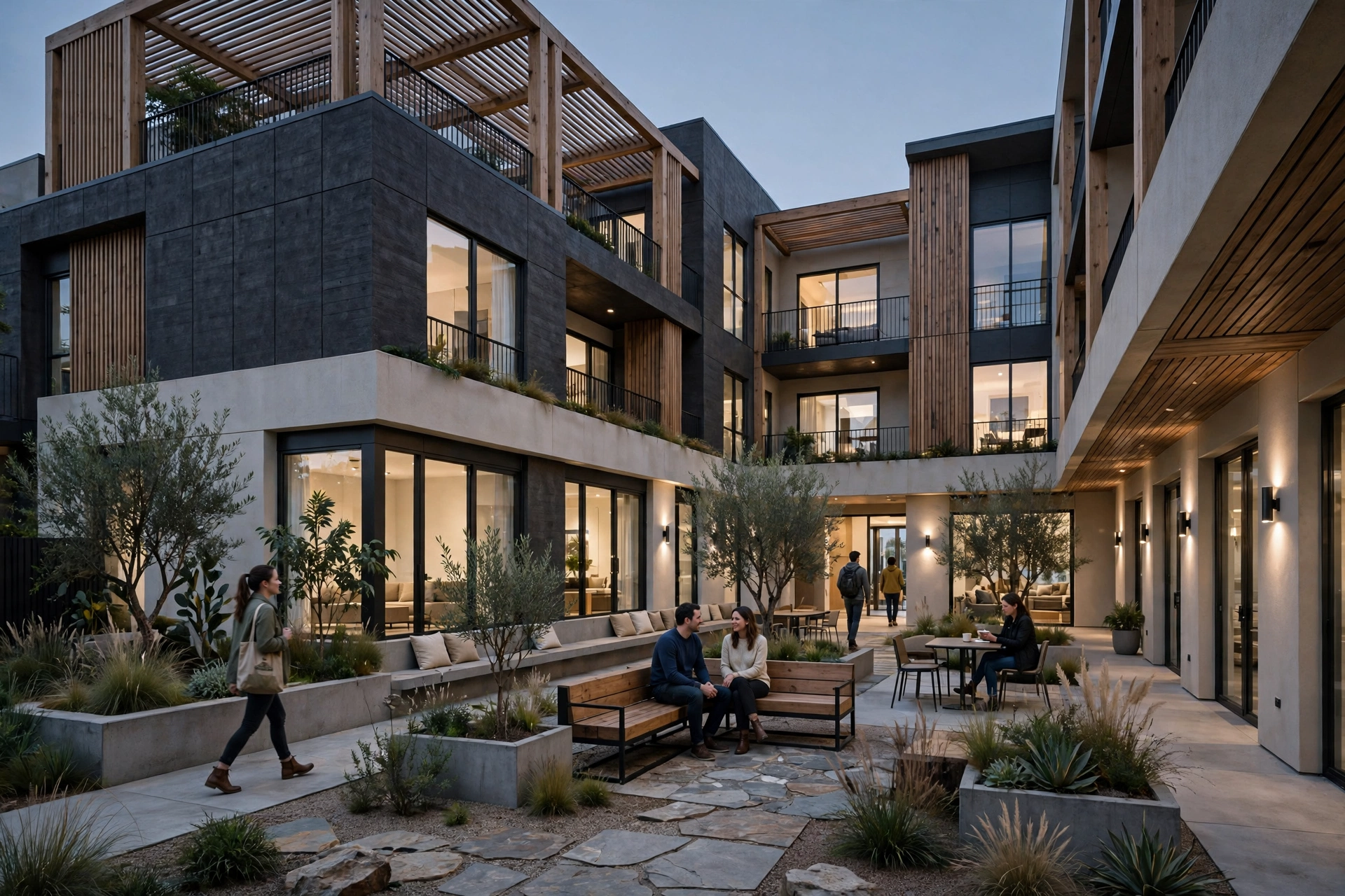
Entourage must match the project, the market, and the season. A luxury villa render aimed at families needs different figures than a co-working office render or a retirement community brochure. Age, clothing, and activity all send signals. Business attire suits an office lobby; swimwear suits a resort pool deck; winter coats suit a snowy exterior. A mismatch, like beach clothes in a mountain lodge render, breaks the story and makes the marketing feel careless.
Activity is the final choice. Static figures standing in a row look like a lineup. Figures doing something believable, reading, cooking, walking a dog, talking over coffee, feel alive. Motion also helps hide the imperfections of cutouts: a walking figure with a natural stride reads as real more easily than a stiff standing pose. For exteriors, walking, cycling, and sitting are the most believable activities; for interiors, cooking, reading, working, and relaxing beat posing every time.
Lighting, Shadows, and Reflections Must Match
A figure pasted into a render without matching light looks like a sticker, and this is the most common entourage mistake. Every figure needs a shadow that matches the scene: same direction, same length, same softness. A sunny exterior needs a crisp, dark shadow falling away from the sun. An overcast day needs a soft, faint shadow. An interior lit by warm lamps needs warm toned shadows, not cold grey ones. If the render is a dusk shot, the figures need the same golden rim light as the rest of the scene, a point our twilight renders guide covers for the scene as a whole.
Cutouts, 3D People, or AI Figures: Which to Use
There are three main ways to add people, and each has a place. Photographic cutouts are real photos with the background removed. They are cheap, look real at a glance, and work well for background and middle ground figures. Their weakness is lighting: a cutout photographed in daylight will never perfectly match a dusk render, and a cutout seen from the wrong angle looks flat. Good cutout libraries are shot from many angles and in varied lighting to reduce this problem.
3D scanned people are full 3D models built from real scans. They cost more and add render time, but they solve the lighting problem completely because they are lit by the same scene as the architecture. They are the right choice for hero foreground figures, close-up interiors, and animations, where a figure is seen from multiple angles. The third option, AI generated figures, is growing fast in 2026. AI can produce a figure in exactly the pose, clothing, and lighting a scene needs, but quality varies and hands, faces, and proportions still need careful checking. Most professional studios use a mix: 3D people in the foreground, photographic cutouts in the middle ground, and AI figures only where they can be checked frame by frame.
Common Entourage Mistakes to Avoid
The same mistakes appear in render after render. Figures floating a few centimetres above the floor because the cutout was not grounded. Figures with no contact shadow where their feet meet the ground. Figures looking directly at the camera in every shot, which feels staged. Figures repeated twice in one image from the same cutout library, which viewers spot immediately. Figures in the wrong season, the wrong dress code, or the wrong activity for the space. And figures that are too sharp: a background figure should be slightly softer than the foreground architecture, because that is how a real camera sees depth.
Our rendering mistakes guide covers several of these in the wider context of realism, and entourage errors are among the easiest to fix once you know what to look for. When reviewing a draft render, zoom to 100 percent and check feet, shadows, and eye direction on every figure. Those three checks catch most problems in under a minute.
How to Brief a Studio on Entourage
A good brief removes guesswork. Tell the studio who the buyer or user is, what the figures should be doing, and what feeling the image should create. A family home brief might read: two adults cooking in the kitchen, one child reading by the window, warm and relaxed, no one looking at the camera. A developer brochure brief might read: young professional couple on the balcony at dusk, city lifestyle, aspirational but believable. Mention anything to avoid, such as children in a bar scene or formal business dress in a beach resort. If the render will be used in a specific market, say so, because clothing and demographics should reflect that market.
Frequently Asked Questions
How many people should be in an architectural render?
For a residential interior, three to five figures is usually ideal. For an exterior or a large public space, five to eight works well. More than that and the architecture starts to disappear behind the crowd. The right number depends on the space: a small apartment needs fewer figures than a hotel lobby, but in both cases the architecture should stay the star.
Should people look at the camera in renders?
Usually no. Figures looking at the camera break the illusion that the viewer is stepping into a real scene, and they pull attention away from the architecture. The exception is lifestyle-led marketing, where a smiling face can be the selling point. In that case, one figure looking toward the camera is enough; the rest should be engaged in natural activity.
Are photographic cutouts or 3D people better?
3D people are better for foreground figures, close-ups, and animations because they share the scene's lighting, shadows, and reflections. Photographic cutouts are better value for background and middle ground figures, where small lighting differences are hard to spot. Most professional renders use both, with 3D figures in front and cutouts behind.
Can AI generated people be used in professional renders?
Yes, with careful checking. AI figures work well when the pose, clothing, and lighting are matched to the scene and the result is inspected at full resolution. Hands, faces, and proportions are the weak points, so AI figures should be reviewed as strictly as any other entourage. For hero foreground shots, 3D scanned people remain the safer choice in 2026.
How much does adding people to a render cost?
Simple cutout entourage typically adds 30 to 75 dollars per still view in 2026. Full 3D figures in the foreground add 75 to 150 dollars per view. Animations cost more because figures must stay consistent across frames. Studios usually include basic entourage in their standard quote, so ask what level is included before assuming it is extra.
Entourage is a small detail with an outsized effect. Done well, it turns a beautiful but empty image into a place a buyer can imagine living in, working in, or investing in. Done badly, it is the first thing a viewer notices for the wrong reasons. The difference comes down to scale, light, placement, and restraint, the same disciplines that make the rest of a render believable. If you are planning a visualization project and want figures that sell the space without stealing the scene, our rendering services guide explains what to include in your brief, or contact our studio for a fixed quote on your project.

Written by
Architecture Designing Team
3D Visualization Studio