Photorealistic Interior Rendering: 15 Pro Tips From a Studio
Interior renders are the hardest images in architectural visualization to get right and the most rewarding when you do. A great interior render does not just show a room, it makes the viewer feel the light, sense the materials, and imagine living there. The difference between a flat, artificial-looking interior and a photorealistic one comes down to dozens of small decisions about light, materials, and composition.
In this guide, our studio artists share 15 professional tips for photorealistic interior rendering, covering lighting, materials, camera work, and post-production. Whether you render in V-Ray, Corona, or Lumion, these principles will lift your interiors to a professional standard.
Lighting: The Foundation of Realism
1. Start with natural light
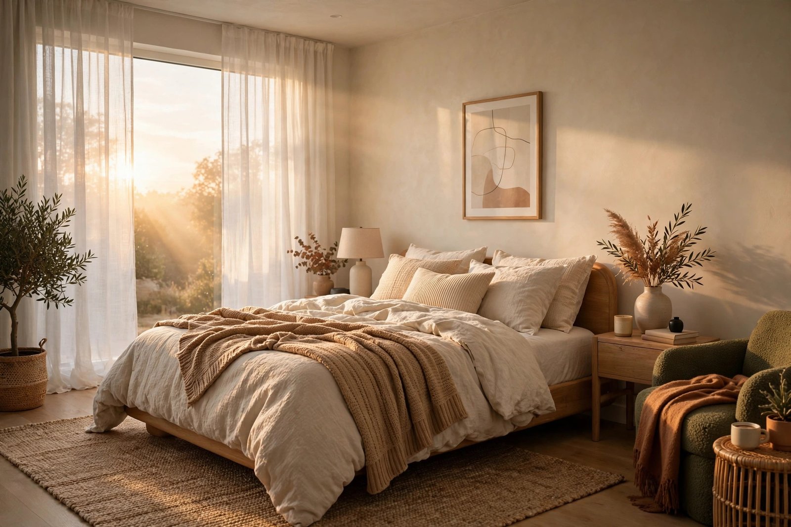
Real interiors are lit primarily by windows, so your renders should be too. Set up daylight coming through openings before adding any artificial lights. Study how sunlight actually behaves: it bounces off floors and walls, creating soft fill light that many beginners forget to simulate. Getting the sun position and sky right solves half the realism problem immediately.
2. Use IES lights for artificial sources
Every lamp, spotlight, and pendant in a real interior throws a specific light pattern. IES profiles are measured data files that replicate these patterns accurately. Using them instead of generic point lights instantly makes artificial lighting look believable, with proper pools of light on tables and realistic falloff on walls.
3. Balance color temperatures
Daylight is cool and blue-ish, interior lamps are warm. That contrast is what makes interiors feel alive. Beginners often make everything the same neutral white, which looks clinical. Let the cool daylight and warm lamps coexist, and your images will gain the depth that real photography has.
4. Do not overlight
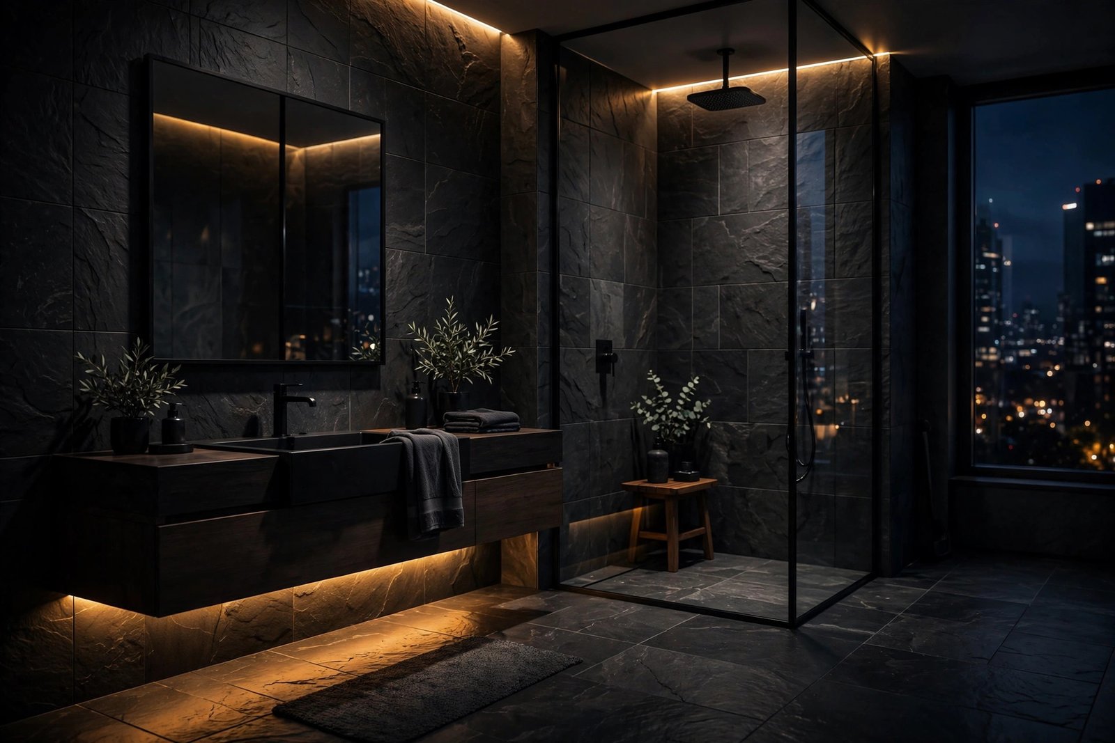
The most common beginner mistake is flooding the scene with light until every corner is visible. Real rooms have shadows, and shadows create depth and mood. Aim for a natural balance where some areas fall into gentle darkness. If you can see everything equally, you have too much light.

Materials: Where Renders Succeed or Fail
5. Invest in good textures
Low-resolution or obviously repeating textures destroy realism faster than any lighting error. Use high-resolution PBR textures with proper diffuse, roughness, and bump maps. For hero surfaces like feature walls and kitchen islands, the texture quality must survive close inspection. There is a thriving market for quality 3D assets, which we discuss in our overview of where 3D models and materials come from.
6. Get reflections right
Almost nothing in a real interior is perfectly matte or perfectly mirror-like. Wood floors have soft, blurred reflections. Polished marble reflects clearly but with slight imperfections. Dialing in realistic reflection glossiness on every material is tedious but transformative. When in doubt, add slightly more reflection than you think, most beginners underdo it.
7. Add imperfection deliberately
Perfectly clean, perfectly aligned interiors look computer-generated because real spaces are not perfect. Slightly rotate a chair, leave a book open on the table, let a curtain hang asymmetrically. These tiny imperfections signal reality to the viewer's brain. The goal is lived-in, not messy.
8. Model the details that catch light
Skirting boards, door frames, cushion seams, and table edges catch highlights that sell realism. Flat, detail-free geometry looks fake even with great materials. You do not need to model everything, but the elements near the camera and near light sources deserve proper geometry.
Camera and Composition
9. Use realistic camera settings
Set your virtual camera to behave like a real one: eye-level height around 1.5 to 1.7 meters, focal lengths between 24mm and 35mm for interiors. Extremely wide angles distort rooms and scream computer graphics. Match real estate photography conventions and your renders will feel like photographs.
10. Compose with intention
Every render should have a clear subject and a visual path for the eye. Use the rule of thirds, lead the eye with furniture arrangements, and avoid centering everything. Leave some breathing room in the frame. Before rendering, ask what the single most important thing in this image is, and make sure the composition serves it.
11. Keep verticals vertical
Unless you are deliberately going for a dramatic tilted look, correct the camera so vertical lines stay vertical. Converging verticals are the fastest way to make an interior look like an amateur snapshot rather than professional photography.
Rendering and Post-Production
12. Render more than you need
Render at higher resolution than your final delivery size, then downscale. This smooths noise and anti-aliasing artifacts. Also render useful passes like ambient occlusion and material IDs, which give you precise control in post-production without re-rendering.
13. Post-produce like a photographer
No professional render goes straight from the render engine to the client. Subtle color grading, gentle vignetting, careful sharpening, and slight contrast curves make images feel photographic. The key word is subtle: if the viewer notices the post-processing, you have gone too far.
14. Check your work at full size
Always review final images at 100 percent zoom before delivery. Noise, texture repetition, and modeling errors hide at thumbnail size and reveal themselves on the client's large screen or printed brochure. Build this check into your workflow as a non-negotiable step.
15. Build a reference library
Collect interior photography you admire and study it alongside your renders. Compare light behavior, material response, and composition directly. Professional artists constantly calibrate their eyes against real photography, and the gap between your work and your references is your curriculum.
Styling and Set Dressing
Great interior renders are art-directed, not just modeled. Before rendering, decide on the story of the space: who lives here, what time of day is it, what are they doing? A family kitchen at breakfast time needs different props and light than a bachelor pad at midnight. This narrative thinking guides every choice from furniture selection to the angle of sunlight.
Build a personal asset library of furniture, decor, and plants that you know renders well. Professional studios invest heavily in curated 3D assets because good entourage saves hours per image. Place items in odd-numbered groups, vary heights, and leave negative space. And always style for the camera: only the visible areas need full detail, so focus your effort where the lens points.
Finally, photograph real interiors for reference constantly. Notice how cushions actually sit, how throws drape, how books stack. The best set dressing comes from observing real life, not from other renders. Keep a folder of reference photos on your phone and consult it before every styling session. Over time, this habit trains your eye more effectively than any single tutorial.
Choosing the Right Software
These principles apply in any renderer, but tool choice affects your speed. Corona is beloved for interiors because its light solver produces beautiful natural light with minimal setup. V-Ray offers deeper control for complex scenes. Lumion is fastest for concept interiors and quick client iterations, and our Lumion effects guide covers squeezing more realism from real-time tools. Master one engine deeply before adding a second. Depth beats breadth in rendering skill.
Whichever tool you use, keep your project files organized and version-safe. Corrupted or incompatible files have ended more rendering sessions than any artistic challenge, so follow solid file hygiene like the practices in our guide to saving 3ds Max files properly. And if you are curious how these tips fit into real client work, our penthouse visualization case study walks through an interior-heavy project from brief to delivery.
Frequently Asked Questions
How long does a photorealistic interior render take?
In professional production, a single high-end interior view takes one to three days of artist time plus rendering time, which ranges from 30 minutes to several hours per image depending on resolution and engine. Quick concept versions can be produced in hours.
Why do my interior renders look flat?
Flat renders usually suffer from overlighting, missing shadows, or materials without proper reflection and texture detail. Reduce your light levels, add IES profiles for lamps, and upgrade your material textures. Nine times out of ten, one of these three fixes the problem.
Is Corona or V-Ray better for interiors?
Both are excellent. Corona is faster to learn and produces gorgeous natural light quickly. V-Ray offers more control for demanding scenes. Many studios use both. For a full breakdown, see our engine comparison guide linked above.
How important is post-production?
Very. Even the best raw renders benefit from color grading and subtle photographic treatment. Budget 15 to 30 minutes of post-production per image, and never deliver raw renders to clients.
Can Lumion produce photorealistic interiors?
Lumion interiors can look very attractive, especially with careful lighting and good assets, though at the extreme high end, unbiased engines like Corona and V-Ray still lead for close-up photorealism. Lumion wins on speed for concept and client-review work.
What is the biggest mistake beginners make with interior lighting?
Adding too many lights and making everything equally bright. Real interiors have hierarchy: a key light source, softer fill, and areas of shadow. Start with natural window light, add artificial lights sparingly, and embrace darkness in the corners.
Written by
Architecture Designing
3D Visualization Studio